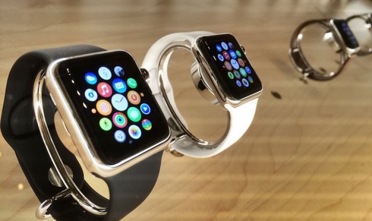
The market share of wearables has been increasing at a steady pace, since their introduction to the world. According to Canalys, in the third quarter of 2017, Apple has shipped 3.9 million smartwatches, overtaking the former wearable leader, Xiaomi from the throne. Statistica predicts that 45% of smartwatches shipped by 2019 will be running the Cupertino giant’s watchOS. As the market for watchOS wearables keeps growing at a steady pace, it makes sense for more developers, designers, entrepreneurs to design apps for this operating system. To make sure that your app will fare well in watchOS, we have rounded up a handful of useful tips!
Image Credits: Flickr
Create an incredible icon
If you want users to notice your app, then you need to create an incredible icon. They are important because the apps on watchOS don’t use text labels for identification. As a result of this, only the icon differentiates one app from another. Keep the app icon as simple and to a bare minimum.
If there is any text in the app icon, remove it for watchOS. The current trend in watchOS apps is a circular icon. Also, Apple’s smartwatches come in two different screen sizes. To make sure your app icon looks consistent, you must design it in such a way that it looks great on both screens.
Keep UI small and minimalistic
Although this is a very basic tip, it is also extremely important when designing for smartwatches. Users of smartwatches only use their wearables for a couple of seconds, unlike mobile users, whose average usage time is in minutes. As the screen estate is small, it is vital that your app shows all the important data at a glance.
For example, if you are designing an app for keeping track of the weather, it should display important details such as temperature and a real feel every time a user looks at the smartwatch. However, the UI should be engaging to keep your users interested in your app. To improve the legibility of the text in your app, use the font San Francisco.
Optimize PNG and JPG assets
Since the screen estate is small, you need to make sure that you optimize your PNG and JPG assets. For example, if you use high-quality JPG that have large file sizes, your app will take a long time to load. As smartwatches are all about speed and reliability, users will uninstall your app.
The best practice is to use lower quality JPGs which will load faster on smartwatches. Avoid cropping your JPGs as it may not look good in a smartwatch. Always use the correct photo size for all your requirements. Similarly, you can save a lot of space by optimizing your PNG assets. For starters, you can keep file size to a minimum by going for PNG-8.
Progressive loading is important
If your app requires a lot of processing power or is heavy for the smartwatch, it is going to time to load. As users want to spend only a couple of seconds on their smartwatches, you need to keep them preoccupied while your app loads its content. The best way to keep your users engaged is to use progressive loading.
In other words, when you are loading your content, show everything else on the smartwatch’s screen. You should never block out the entire screen and only display the loading screen. By following this tip, your users will believe that your app has fast loading times.
Processes should be fast
As users spend only a couple of seconds on their smartwatches, you need to make sure that your app is fast and responsive. When developing your app, make sure that you test it thoroughly for bugs and errors. At the same time, you should keep optimizing your mobile app so that is is as fast as possible. Since your app doesn’t need to have all the features of its mobile counterpart, you can skim some of the features. Also, if your users aren’t using certain features of your app, you have the liberty to remove it as it is irrelevant.
Use minimal colors
To improve the legibility of your app, it is crucial that you use minimal colors. When the hues are simple, it will complement the background of the smartwatch, improving the legibility of your app. You should avoid using different or bright colors throughout your app because it can be confusing. Also, you can maintain brand consistency by using the same set of colors on your app.
Utilize animation for improving user experience
To improve the user experience of your mobile app, you can use animations. However, make sure that you don’t use a large number of animations as it can make your app look slow. You can use animations for parts of your app that need attention. For example, when a user taps on the notification, there can be subtle animation, transitioning from notification to the user interface of the app.
Use these tips to design an app for the Apple Watch. If you are finding it difficult, why don’t you get in touch with Robust Tech House? Our developers and designers will build an app that functions well on the Apple Watch!
Brought to you by RobustTechHouse


Very interesting points you have remarked, appreciate it for putting up.
Dear immortals, I need some wow gold inspiration to create.