
Contents
Introduction
A couple of years ago, we were figuring out how to use the smartphone, figuring out designs consumers would find appealing. Today we are way past that, we are discovering nuance and exact solutions that work best. It is impossible to cover everything since there are new apps being made every single day. But here are the most important trends that we are currently noticing.
Minimal Interface
A shift towards User Experience has been emerging within the app design industry. Design has taken a backseat due to the developers understanding the fact that their product should be clear and concise towards their user to ensure the best output an app can give. Stylized and 3D solutions have lost their popularity in favor of flat design which turned out to be the best suited one for modern screens.
Therefore a simple UI should feature clarity and functionality to the user, taking into consideration the advantages modern screens provide (size, picture quality, color depth). Aspects of a minimalist interface should be incorporated, like big, clear buttons with intuitive graphical representations if available. It’s very important to let your app breathe so make sure you have empty space, don’t clutter your application with useless features, only keep what’s essential.
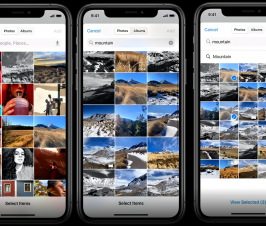
Swiping is the gesture of choice
Apps that had a card-based information feeds have definitely touched upon improving the swipe feature and making it go mainstream. With an increase in phone and tablet size the buttons are now clearer with more room for navigation. In the early days you couldn’t swipe because the screen was literally too small to use with consistency.
Swiping will most likely be introduces into a variety of functions, ranging from setting up to the general purpose of the app in question. Apps like Twitter, Tinder and Pinterest board have introduced swiping into their feeds with great success. In case of Tinder it became a marketing meme, which is genius on its own merits.
Keep you colors fresh
Previously we’ve seen a lot of grays in our coloring pallets. It made sense since they fit really well along white surfaces. Vibrant colors are coming back in style however. We are seeing that with recent UI design solutions through a more active usage of reds, blues and greens.
Some find it hard to deal with colors, I get that. It’s something that has to be trained. You don’t want to end up on the CrappyDesign subreddit, you really don’t. However, professional from Bapple web design agency advise to familiarize your self with the color theory, even before you start designing.
VR/AR Takes Form
If we had a conversation 5 years ago and discussed this topic, I’d tell you that quality VR/AR is far, far away. However, companies like IKEA have developed apps with amazing Augmented Reality, truly showcasing the potential that was hiding all along.
The same thing happened in the gaming industry as well. Games like Pokémon GO will continue to emerge. The only missing link is optimal gameplay, but I feel like developers are prototyping daily so we are probably months away from such a market-changing product.
Whatever reality currently holds, the market speaks for itself. Most of the venture capital is pouring in this industry segment. If you want a slice of that sweet digital market pie, I suggest considering VR/AR as they are the moneymakers of years to come.
If something is quickly going out of fashion, it’s is navigating through app screens. Just by looking at most modern apps, we can safely say that there are three main issues with app design regarding navigational issues.
What comes to mind as well is one-handed navigation. Screens today are quite large and it feels almost awkward using some models with just one hand. Figuring out ways to engage both hands in a meaningful way will be a difficult task to solve, but could reward the trendsetter.
Linear navigation requires all users to have no leeway in which they use their app. Everyone must follow a streamlined process from point A to point B, no exceptions. While this is useful for certain products and services it offers little space for innovation. For example, you won’t be able to implement new features due to you user base developing a strong habit of using your app in a certain way.
Lastly, the dreaded hamburger menu will continue to haunt us. The menu has been accused of disengaging users from app, promoting poor app architecture and honestly, lazy interface design.
Conclusion
The app industry surprises me every year. The amount of innovation achieved and money invested into R&D is growing year by year. The market will be evermore transformative and I feel articles like this one will pop up quarterly instead of annually in the future.
Brought to you by RobustTechHouse
Also published on Medium.


Thank You for this.
Dear immortals, I need some wow gold inspiration to create.
Cool! I wasn’t aware of these valuable resources. When I was refreshing my branded products, I chose to explore some new concepts. I visited pine tree silhouette to seek advice on refining my website. With the insights gained, we thoroughly discussed every detail, and I was pleased with the outcome.